What is a 404 Page & 8 Tips for Customizing Your 404 Pages to Improve UX

Whether you’re an SEO specialist or a website owner, you will come across a 404 error page at some point in your life.
But what is a 404 page, exactly? It’s more than just an error notification; when customized thoughtfully, a 404 error page can enhance user experience, subtly directing visitors to continue their journey on your website. Conversely, a poorly designed 404 page can be a point of frustration, potentially driving your audience away.
WHAT IS A 404 PAGE?
What exactly is a 404 page? A 404 error page is what users see when trying to reach a non-existent page on your site, either because they’ve clicked on a broken link, the page was deleted or moved without proper redirects, or they’ve mis-typed a URL. Because the page is not identifiable, it is also known as a “Page Not Found” page.
As website owners, some of these situations are within our control, like page removal, broken internal links, or improper redirects—and some are not, like users making typos in the URL or broken links from external sites.
For those we can control, there are technical SEO tactics to find and fix 404 error pages so they don’t hurt your SEO.
For those we can’t control, you can still provide the least frustrating UX by implementing a 404 page that still drives value for your users and is customized to your brand and sales funnel.
WHY IS A CUSTOMIZED 404 PAGE IMPORTANT?
A website is an important aspect of your business. Whether you use your website to build your brand, get in touch with your customers, or hold transactions, when a user cannot find a page on your website, your business suffers. That is why presenting a well-crafted 404 page to users is important.
The biggest benefit of a well-crafted 404 page is improved user experience. When users stumble upon a 404 error, it often results in confusion and irritation, which can lead to a quick exit from the site. A standard 404 page offers little beyond the bare fact that the requested content cannot be found. In contrast, a well-designed custom 404 page acknowledges the user’s inconvenience with friendly language, maintaining the site’s aesthetic and voice and thereby preserving a sense of familiarity and trust. Importantly, it shows to users that you care about their experiences on your site.
Furthermore, a customized 404 page can serve as a useful navigational aid to guide your users to explore your site. By including a search bar, a list of popular or suggested content, or direct links back to the homepage or major site sections on the 404 page, it encourages the users to continue their journey rather than abandoning the site. Last but not least, customizing a 404 page gives you an opportunity to showcase creativity and humor, which improves brand perception and engagement and potentially turns a negative experience into a positive interaction.
8 TIPS FOR CUSTOMIZING A 404 PAGE
With the importance of a well-designed and crafted 404 page in mind, you may be wondering: how should I customize a 404 page?
If you are looking for quick tips, check out APAC in 3 (EP 11) for how you should be optimizing your 404 error pages to drive value and increase conversions.
And for a deeper dive on all 8 tips (with examples!), read the full explanations below.
Custom 404 Page Tip 1: Go beyond the basics
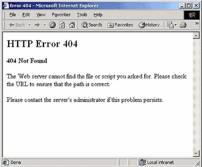
This is the classic default 404 page returned from the server:
Classic 404 Error Page
It’s plain, ugly, and doesn’t give any choice to the user but to leave your site right away.
Instead of this, you can create a custom 404-page on brand to provide extra information to help the visitor stay on your site and navigate to further content—and deeper within your sales funnel.
Custom 404 Page Tip 2: Generate a HTTP 404 server status code
A 404 page should at least perform its most basic function: Generate a 404 HTTP server error status code to the search engine.
Some people may misunderstand the meaning of a custom 404 page as creating a regular webpage (e.g., a page with a URL that ends with /404notfound.html) with a simple text error message.
This kind of page is called a “soft 404,” which means a page that serves what looks like 404 content to the user but is actually a 200 all-is-well server status code to the search engine, while users get no information and thus likely jump away from the page.
Creating a soft 404 is a bad practice that confuses the crawler and hurts the site’s SEO. A proper 404 page should return a proper 404 HTTP response code from the server and retain the URL as is so that the error can be tracked and fixed accordingly.
Custom 404 Page Tip 3: Show your visitors that you care about their experience
When visitors click your URL from the SERP but do not see the content they expect, most feel frustrated, particularly when the 404 page does not communicate the error in human terms but rather only shows HTTP server codes and technical terms.
A good 404-page should be simple and clear and explain to visitors why they landed on this error page with clear messaging that you are trying to help them through this inconvenience. This reduces frustration and helps visitors stay on your site with a good impression, rather than leave right away with a bad one.
Custom 404 Page Tip 4: Let users search
When visitors click your URL and come to your site, they’re looking for something—some type of content to meet their needs.
If you can’t show that exact piece of information, why not let your visitors tell you what they’re looking for so that you can provide the most relevant page? Introducing the trusty search bar!
Take our 404 page as an example:
The Egg Error Page
After a simple and clear sentence explaining the error, we prompt the visitor to search for what they’re looking for. That way users can find what they need. And this can help you understand your visitors’ search intent and maybe even turn that knowledge into a new piece of content. Win-win!
Custom 404 Page Tip 5: Guide the user deeper into your site
If yours is an e-commerce site, you may also add links to your category pages. As some of your visitors may not have the exact product name they’re looking for (e.g., women’s oversized denim jacket), you can direct them to a related category (e.g., women’s jacket).
Although a 404 page cannot pass any link juice through links, the main function of these links is to guide your potentially frustrated visitors to further navigate your site. It helps minimize the negative effect of the 404 page and smoothen the customer shopping experience by providing options.
Land’s End’s 404 page is a good example of adding category links:
Land’s End Error Page
Providing 4 links (3 category links and 1 direct link to the homepage) is an appropriate number of links, offering clear options while not overwhelming.
Custom 404 Page Tip 6: Turn errors into sales
For an e-commerce site, most of your visitors are looking for something to buy. You definitely don’t want your potential customers stuck on the 404 page or to leave your site immediately.
In addition to guiding the user with categories, you can also provide some recommendations.
Check out Fortress as an example:
Fortress Error Page
They layout is clean and shows potential customers what’s happening in store right now. For your 404 page, you can recommend best sellers, new releases, special promotions, and more.
Custom 404 Page Tip 7: Generate leads!
Optimizing your 404 pages also works if you are a service provider. You can generate leads through your 404 page by adding a call-to-action button or a form-fill function asking visitors for more information.
Check out the brilliant 404 page from Sproutsocial as an example:
Sproutsocial Error Page
The layout of their 404 page is simple and clean while offering 2 options for users: request a demo or visit the homepage.
The smart green design of the primary call-to-action button helps direct attention away from the secondary option of visiting the homepage. They also have two other CTAs—Sign Me Up (for newsletter subscription) and Start Your Free Trial—both of which are all about lead generation.
Custom 404 Page Tip 8: Impress your visitors
Last but not least, you can use your 404 pages to impress your visitors.
A good custom 404 page can be used to show your brand culture and increase your brand equity by leaving a good impression on your visitors with a creative brand message.
This is my favorite 404 page I found while researching this article:
Ready-to-Go Survival Error Page
Ready-To-Go Survival made their call-to-action buttons into red and blue pills, in reference to the Matrix movie, which matches their brand image: a retailer of survival kits. Honestly, it doesn’t even really matter where these 2 buttons lead; visitors want to click on either one of them—or both!—just for the fun factor.
***
While you may be aware of technical SEO tactics for finding and fixing 404 error pages, you may have overlooked the importance of having a good custom 404 page to create a positive influence on your site visitors, which leads to greater brand warmth and ultimately can increase leads and sales in the long term.


